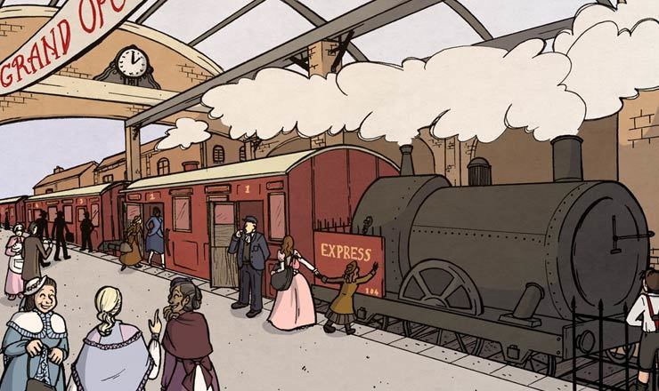
Going to take a wild guess here — 1894?
Hey, not everybody would even take note about the serifs, so don’t sell yourself short.
I always knew that fonts without serifs were evil!! (I suffered from overexposure to Comic Sans MS when I was in elementary school …)
Arial works well enough for English, but when the text is not so predictable, it can be bothersome. Uppercase “i”, lower case “L”, and the number 1 are identical, or almost so.


Diat60 over 5 years ago
Going to take a wild guess here — 1894?
scyphi26 over 5 years ago
Hey, not everybody would even take note about the serifs, so don’t sell yourself short.
erin.adamic Premium Member over 5 years ago
I always knew that fonts without serifs were evil!! (I suffered from overexposure to Comic Sans MS when I was in elementary school …)
rwstyles1234 over 5 years ago
Arial works well enough for English, but when the text is not so predictable, it can be bothersome. Uppercase “i”, lower case “L”, and the number 1 are identical, or almost so.